When Jollibee set out to refresh its global identity, it turned to London design studio Shed to do more than redesign interiors. The Filipino fast food chain asked to distill joy into a physical space. Unveiled in five new locations across Hong Kong, the latest concept features a curated colour palette, layered materials, custom furniture and graphic elements inspired by Jollibee’s Filipino heritage. Inside Retail spoke withShed co-founder Matt Smith about the creative process behind the trans
ansformation, what it took to build a space that feels as joyful as it looks, and what other culturally rooted brands can learn from Jollibee’s global leap.
Inside Retail: What was the original brief from Jollibee, and how did you interpret it to shape this bold new concept?
Matt Smith: The task was clear but ambitious: Take Jollibee, this incredibly loved, culturally rich brand, and create a new brand concept that could carry it confidently onto the global stage. It wasn’t just about rolling out another store format, it was about designing a space, and creating a design language that would be instantly recognisable anywhere in the world, while still retaining everything people love about it at home.
We interpreted that as a chance to define a new kind of restaurant environment. One that doesn’t rely on trend or theme, but is built with a clear brand strategy, reflecting the core brand spirit, to support Jollibee in becoming a global icon. We took joy – the essence of the Jollibee brand – and let that guide the palette, form and art direction of the brand and interiors. The result is a concept that doesn’t just say ‘Jollibee’ – it feels like it. It’s distinct.
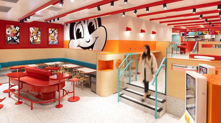
IR: How did you weave Jollibee’s brand story into the physical space in a way that’s both intuitive and emotionally resonant for customers?
MS: Design plays a big part in helping a brand be understood by its customers. For Jollibee, that means joy has to live in the bones of space. Our mantra was ‘Putting joy at the heart of everything’ and we stuck by this throughout. The visual language translates into the physical space. This means it influences how people move through the environment, how it welcomes them and leaves them feeling happy.
We played with form language that felt round, soft and bright. Colour did a lot of the heavy lifting too, with a palette that feels both contemporary and unmistakably joyful. Everything gently reinforces the feeling that this is a place where you feel good.
IR: What role did graphic design and signage play in enhancing the brand identity within the physical environment?
MS: The visual identity of the Jollibee brand needed to evolve as part of this new concept to reinforce the message of ‘Putting joy at the heart of everything’. We treated graphics like a form of environmental storytelling: they’re bold when they need to be, and subtle when they should support.
One standout graphic is Chickenjoy Forever – it helped own the space and is more than a mascot. We treated it like a piece of art, like a stake in the ground for the brand. Elsewhere, touchscreens, menu displays and promotional artwork and signage all follow the same cohesive design language. The whole environment is designed to feel intuitive, unified and unmissably Jollibee.
IR: What were the biggest challenges in designing for a globally recognized, culturally rooted brand like Jollibee?
MS: There’s a balance to tread when a brand is both global and deeply local. Jollibee means something very specific to millions of people – it’s nostalgic, beloved, almost iconic. But to grow globally, it needed to evolve without losing its soul to transcend its geography and culture.
The breakthrough was understanding that joy is universal. It’s not something you have to translate. By designing around emotion, we could build a space that feels familiar to loyal fans and inviting to new customers. This allowed us to scale the design globally.
IR: What aspect of the final design are you most proud of, and why?
MS: Honestly, it’s seeing strategy come to life. We often start with these big-picture ideas and there’s nothing more satisfying than seeing them translate into a physical space that actually works.
People walk in, they smile, they linger, they order more and they come back. That’s not luck – that’s what happens when design is grounded in insight and executed with care. Sales going up is great. But people connecting with space in the way we hoped is the real win for us.
IR: What learnings from this project will you take into future work with other heritage or culturally rooted brands?
MS: Know what to hold onto and what to evolve. That’s the biggest one. You can’t treat every brand the same – some need to stay close to their roots, others need a push to grow into their next chapter.
For Jollibee, we learned that global reach doesn’t mean sacrificing identity. In fact, focusing on the emotion of joy which is at the heart of Jollibee, rather than any kind of surface-level storytelling, is what can give a brand the boost and pathway it needs to scale.